

SERVUS!
Imagine being able to entrust any task to somebody incredibly efficient, discreet and driven so that you can concentrate on other things. Leisure activities, time with your family or the demands of your business - no matter what you want to do, there's a man who can take care of almost any task imaginable, and if he can't see to it himself he can certainly find someone who can, and it can all happen with the least of fuss and the least of time. That man is Richard Long.
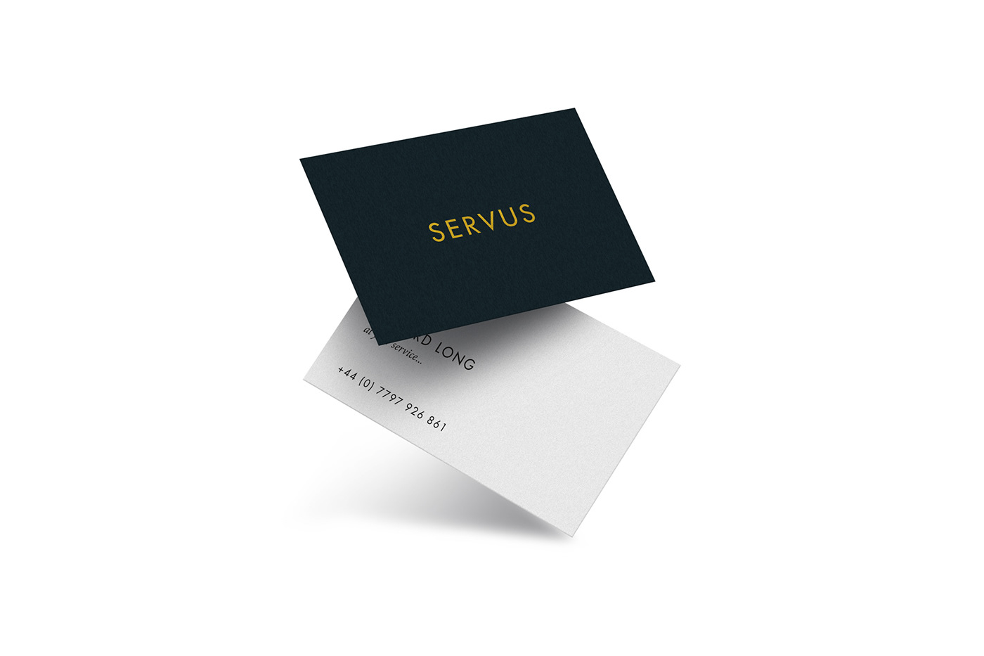
Creating a brand identity for an entity that caters for almost any need imaginable (as long as it's legal, of course) - from logistics planning and property maintenance and preparation worldwide, down to chaperoning your kids abroad or sourcing tradesmen and suppliers - was no mean feat, but with one line of investigation in particular I knew I'd struck gold: servus.
Still used as a greeting in many European countries, and originating from the Latin word of the same, meaning servant or to serve, it seemed a logical choice for a gentleman who can serve your every need whilst being extremely approachable, it also led to the tagline 'at your service...'
The overall aesthetic is clean, sleek and exclusive looking to reflect the military precision and exclusivity of the bespoke services offered. Gold foil blocking on black using the timeless Futura typeface on one side, contrasting with a generous helping of negative space surrounding the text on the white board of the other side of the card. The text on the rear reads 'Servus! Richard Long, at your service' along with his mobile number. Also, due, in part, to the sheer breadth of what Richard can provide and achieve, and in part due to the incredibly discreet nature of the work, nothing on the card indicated exactly what it is that he provides.
It's simply a case of if you know, you know.


